What is Whitespace?
Whitespace, also known as negative space, is essentially the blank space on a webpage — the “empty” space between text, images and other elements where there is no content. Despite the name, whitespace doesn’t need to be white; it’s simply the empty space, of any colour.
Whitespace can be used very elegantly. For instance, most of us are familiar with Google and Apple’s websites, which utilise whitespace very well:
How to Use Whitespace
Use whitespace to break up the elements of the page. There are many good ways to do this, so find some other sites that use whitespace elegantly, such as Google, Apple, Squarespace, Typecode, Starbucks, and others you may come across.
Use whitespace to break up the page nicely; allow the elements to “breathe” in the page, giving them ample space and making the page more visually appealing. Think about the margins between elements, grouping related elements closer together than unrelated ones, but always leaving a nice amount of whitespace.
Not only does more negative space look nicer, but whitespace has been shown to improve readability. Improving the aesthetics of your website means users will find it more appealing, and they’ll be more likely to hang around and share and discuss your site with others, which is very important for effective SEO.
Passive vs Active Whitespace
There are two main types of whitespace: passive and active.
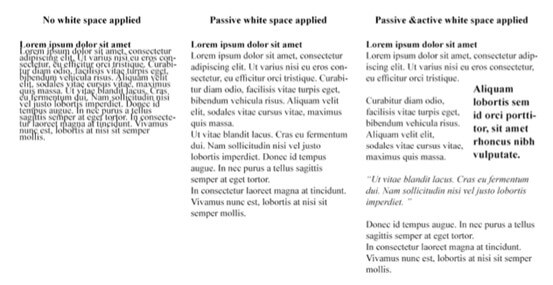
Passive whitespace is intended to solely improve design, without guiding the user in any particular way.
Active whitespace, on the other hand, directs or ‘guides’ the user through the webpage’s content.
Consider the example below — which version do you find more appealing and more readable? This illustrates quite well the distinction between passive and active whitespace.

Final Thoughts
There are many ways to use whitespace, and there is no one “correct” way to make use of it. The best way to familiarise yourself with using whitespace is by looking at examples both online and off. Notice how whitespace is used to improve the flow of a webpage’s design; how elements are broken up and given space to breathe on the page.


